LOGO DESIGN + NAMING + BROCHURE DESIGN
EMERALD DIGITAL PASS
I worked closely with Karine and Liesbet to create a new identity for Emerald Digital Pass, a new venture from Cargill into a steel focussed Digital Product Passport (DPP).
The team were keen to create a professional looking, elegant identity that they could use for their current offering but could be used across a wider community as the product grows. Therefore, the focus of the name and style are on sustainability, transparency and connectivity rather than iron ore or steel.
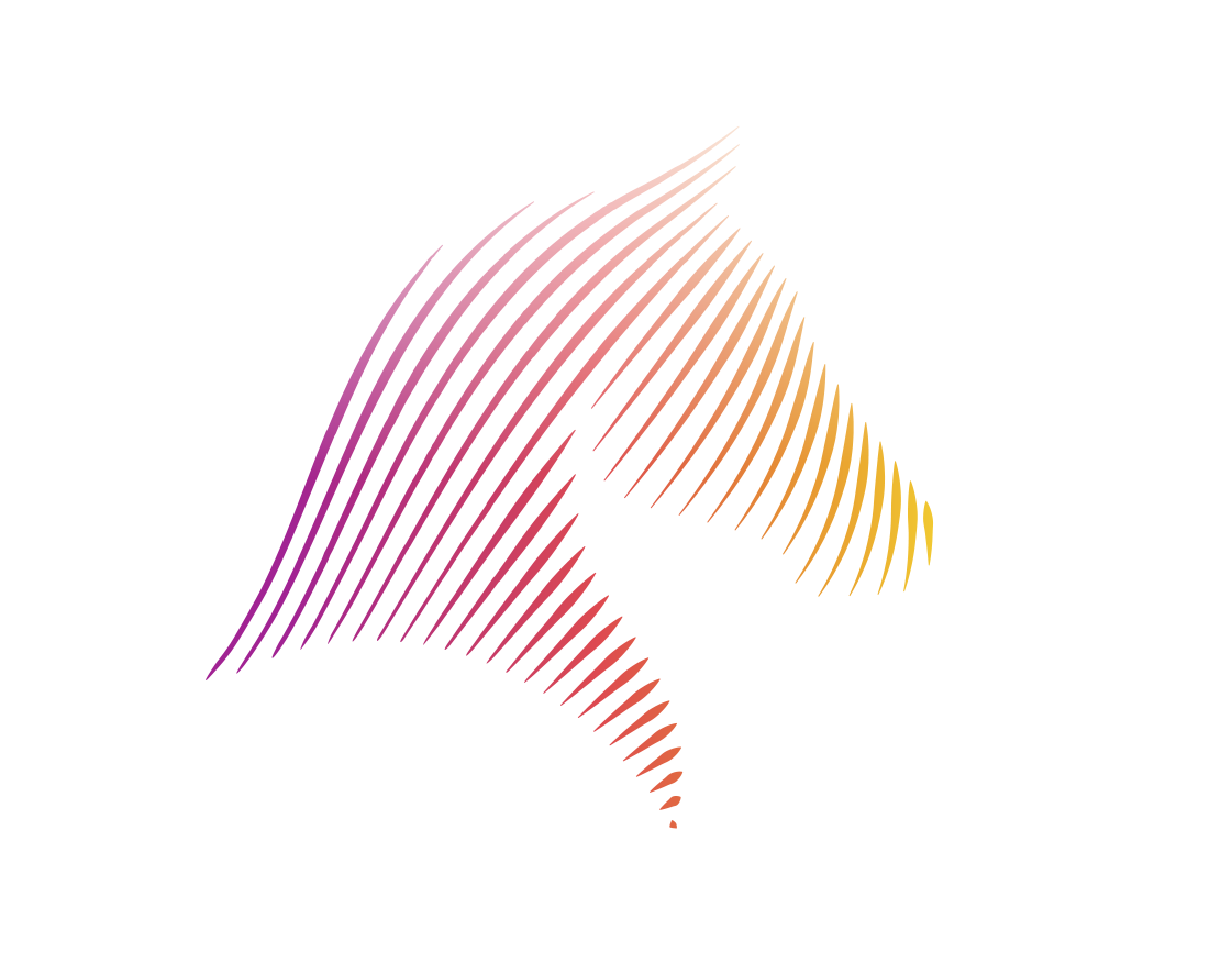
The Emerald name stems from combining the transparency of crystal and the colour green, which symbolises sustainability. The icon then combines the shape of an emerald stone with a connectivity diagram to signify transparency and sustainability in the data shared on the DPP.
A really interesting project to work on and a fab result for all.
