
LOGO DESIGN
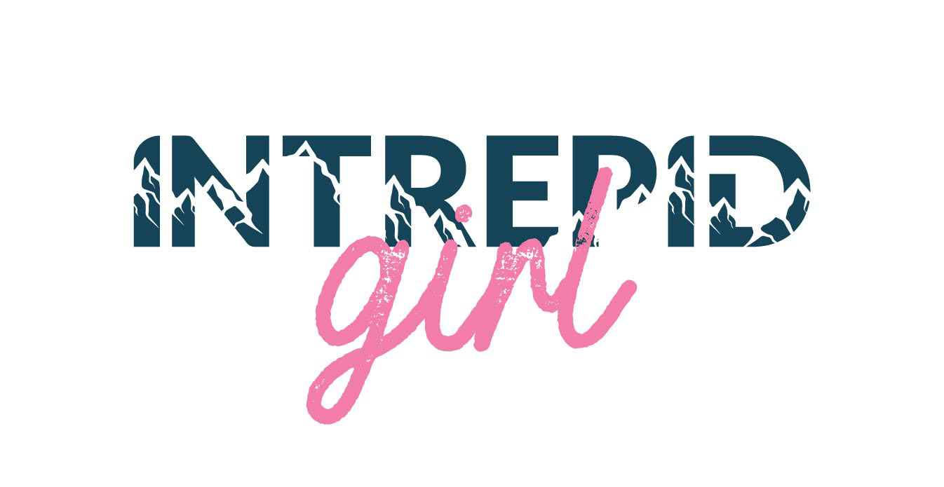
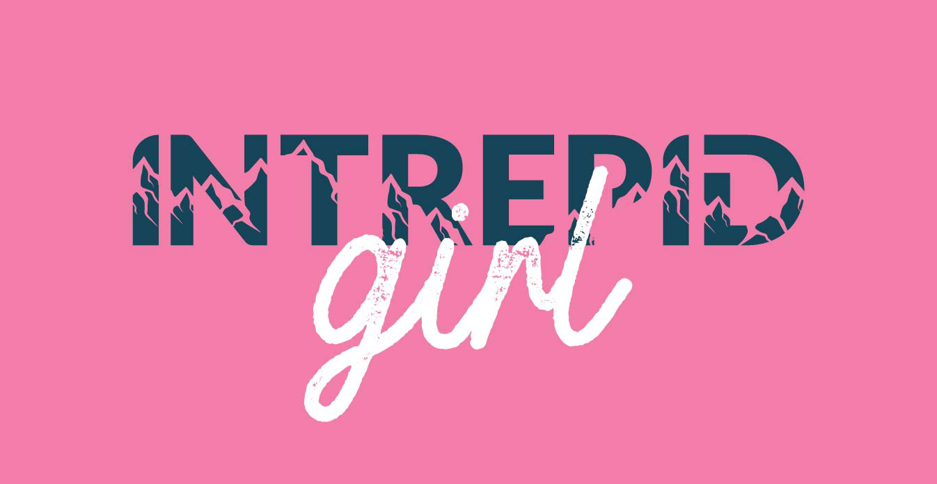
INTREPID GIRL
One of my favourite projects to date!
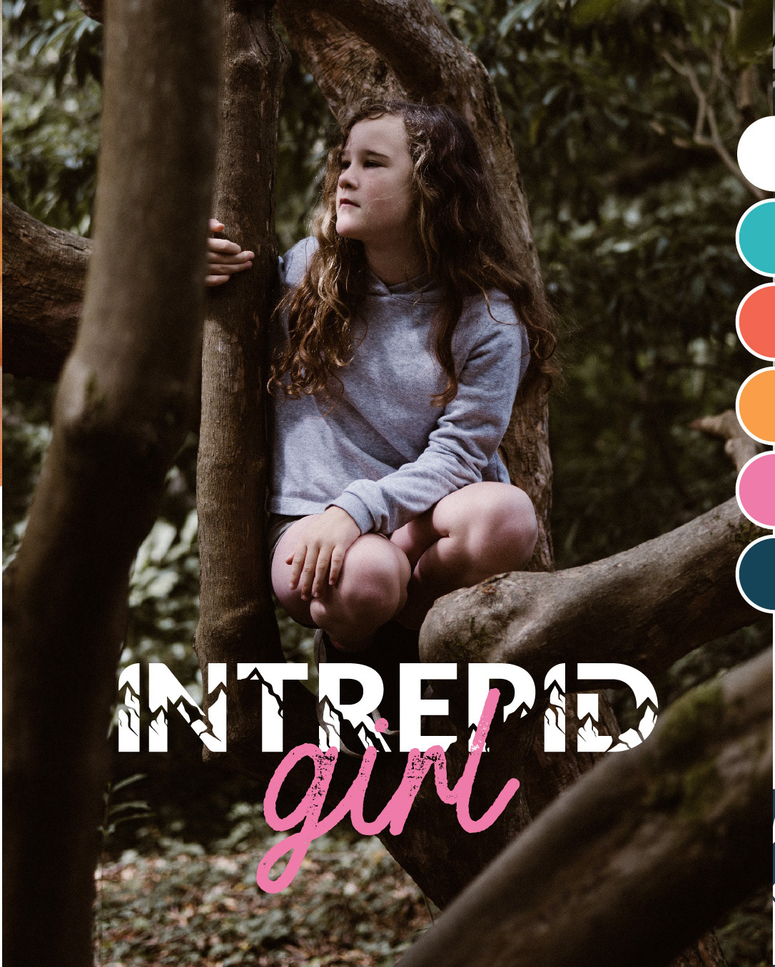
I worked with Katie to establish a strong brand for her new business, Intrepid Girl, an outdoors brand aimed at young girls based in Weybridge, Surrey. It was important for the brand to have a rugged and outdoorsy feel whilst also being fun and appealing to girls aged 5-10. The trick here was to get the balance right between rugged and outdoorsy vs girl focussed.
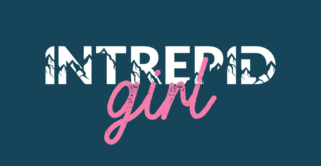
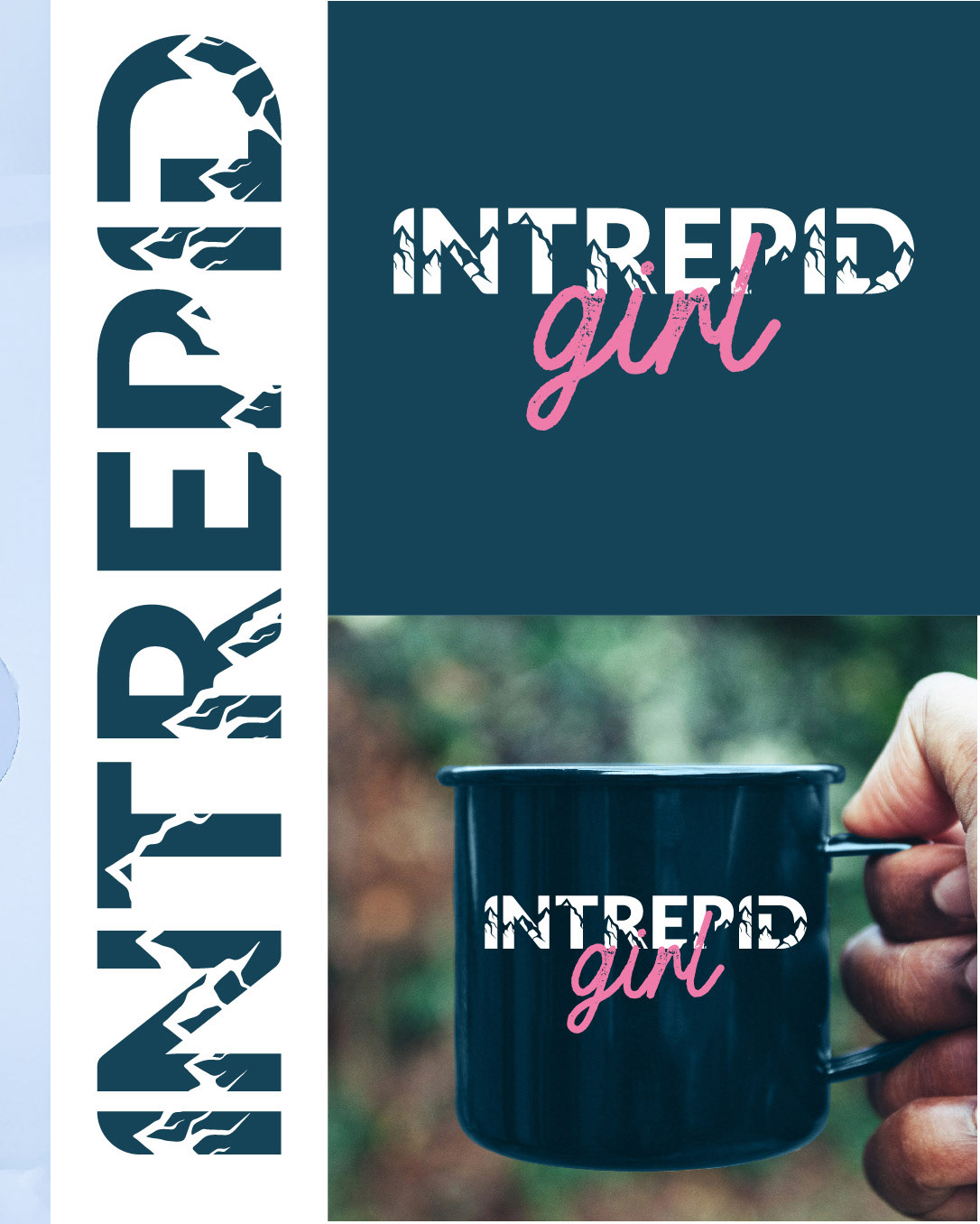
The combination of bold 'Intrepid' lettering alongside the 'girl' script starts to address this balance. The addition of the mountains shown in the 'Intrepid' lettering add to the logos outdoorsy and adventurous feel. This brand is for strong girls who want to go for it, highlighted in the brand strap-line 'Though she is little, she is fierce'.
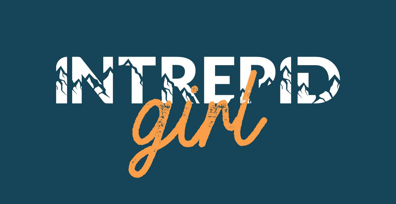
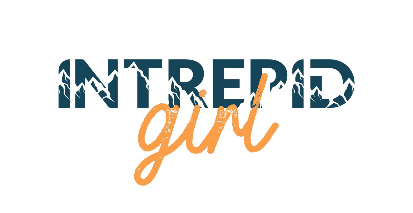
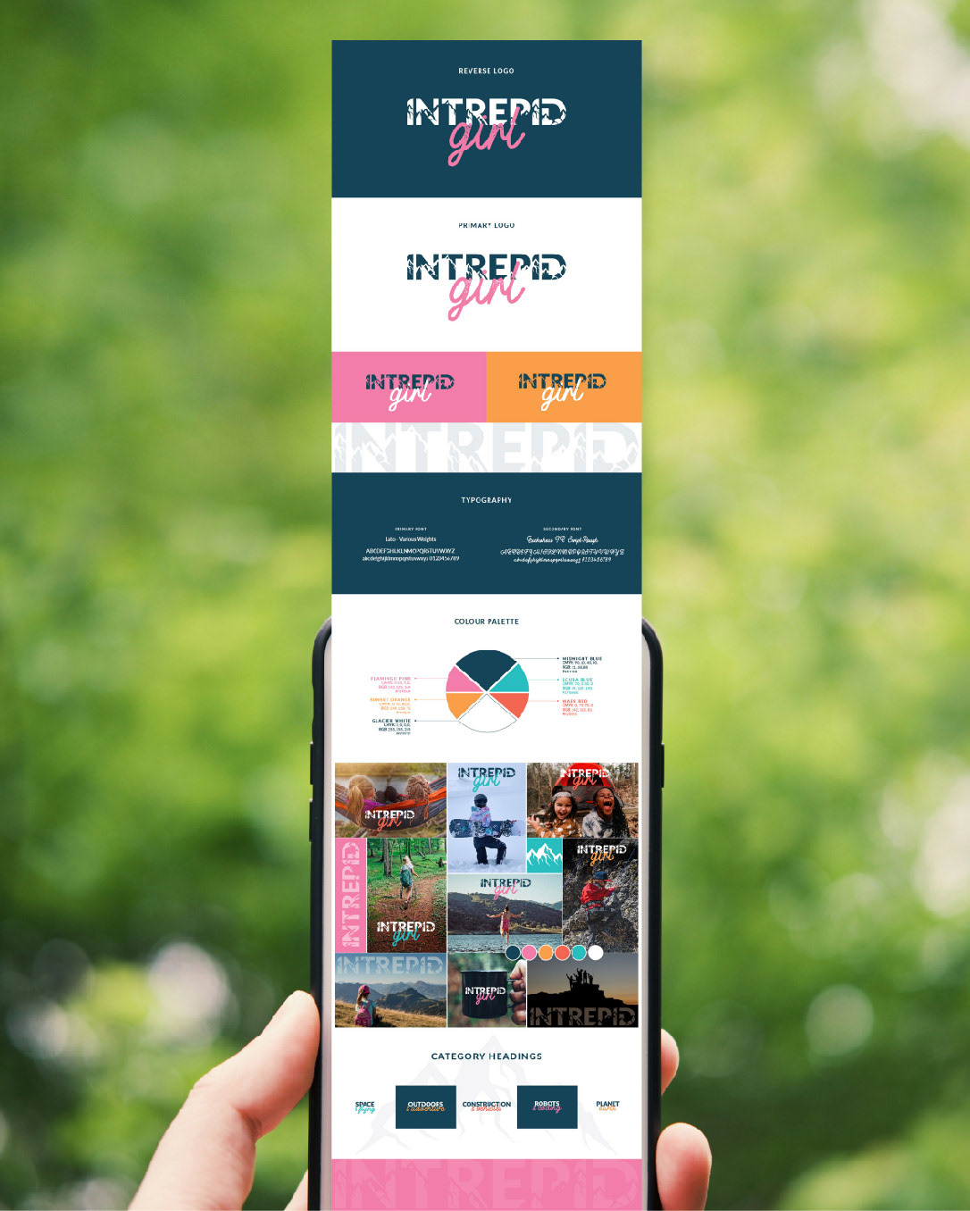
The funky, bright colour palette is also intrinsic to this brand's success. If you look into many of the brands directed at girls today the colour pink often plays a big part. As a mum of 4 young girls Katie understood the reason for this and so was keen for pink to play a part in the new brand. The question was how to include the colour pink without it becoming a girly pink brand? By teaming the pink with a bold font shown in a strong dark blue we've achieved this. The additional bright colour palette also plays a big part in separating this brand from many other 'girly' brands.
Both Katie and I are delighted with the result and I look forward to seeing how the wider brand evolves in the coming months.
Click here to find out more about the incredible Intrepid Girl brand >>> Though she is little she is fierce